
Design Lead, Research & Strategy
Clint Health
The foundation for this product came from years of accumulated work at Clint Health. The company had spent years developing expertise in processing and modeling healthcare data, including research into how EHR data could be matched to clinical guidelines with precision. One of the founders, an experienced cardiologist, brought deep domain knowledge that shaped both the data science approach and the clinical assumptions behind it.
As design lead, I had been involved in that research over time, reviewing findings and applying them across different product concepts, as represented in the image. By the time this project began, I had a strong working understanding of how the matching logic functioned and where the gaps and edge cases were.
With that foundation in place, we conducted interviews with primary care physicians and cardiologists across experience levels and practice settings. The goal was to stress-test our assumptions and understand how guideline-based treatment worked in clinical reality, not just in the data models.
The picture that emerged was consistent: physicians valued guidelines highly but rarely consulted them during appointments.
— PCP · ~5 years experience · Large hospital system
The most commonly used resource was UpToDate. When we asked participants to walk us through a real lookup, a clear friction point emerged: the content is comprehensive but written for every possible patient, not the one in front of them. Physicians had to read through dense clinical text and manually determine what applied to a specific set of labs and risk factors.
Very complete resources but not patient specific
Having reliable tailored recommendations is ideal
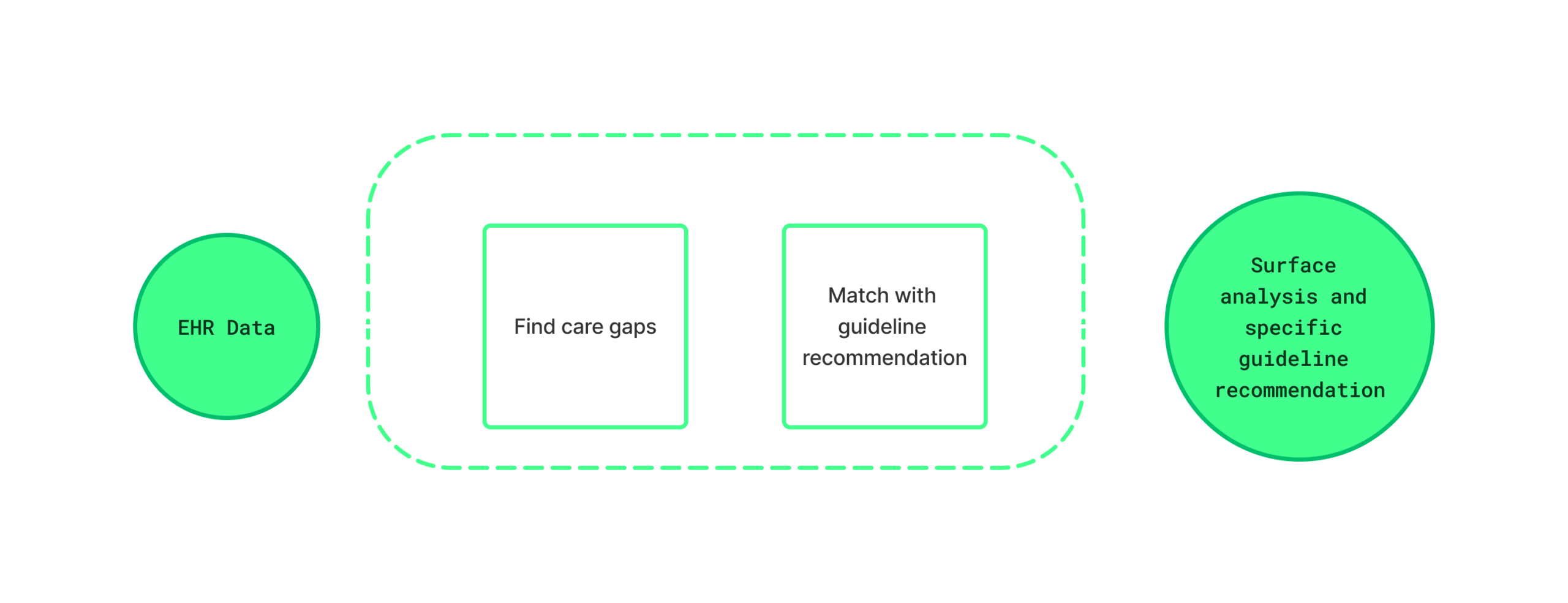
Combining the user insights with Clint’s existing data science capabilities and clinical research gave us a detailed picture of what the product needed to do. We mapped out the full workflow: how a physician would encounter a care gap, what data would surface it, how the guideline matching logic would work, and what the interface needed to communicate at each step. That definition work happened before design began, and it was essential to giving the external design team a clear and grounded brief to work from.
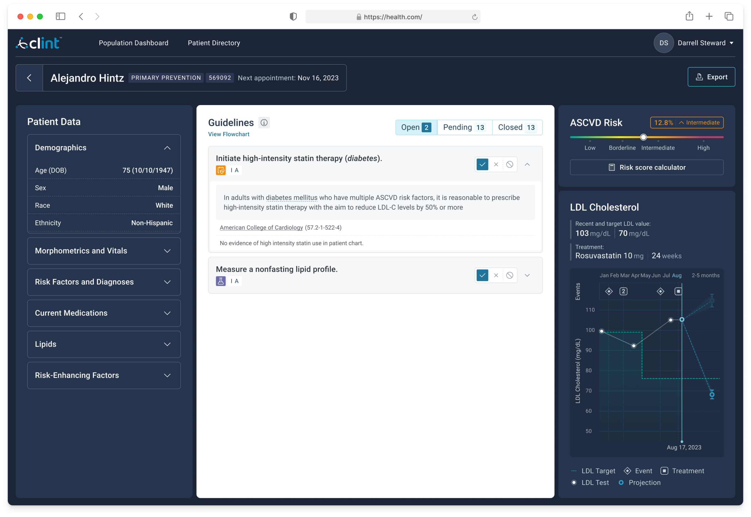
That process led to the core design principle: connect guideline logic directly to patient data so the recommendation arrives pre-translated, requiring no additional lookup.
One outcome of the external design engagement was the creation of a dedicated design system for the platform. As the sole in-house designer, building a system of that scope alongside the product work wasn’t feasible, so I made the case for including it as part of the engagement scope.
The design company delivered the initial system alongside the product. After the engagement ended, I took ownership of it, applying it across other Clint Health products and expanding it as new needs emerged. It became the foundation for consistent UI decisions across the broader platform.
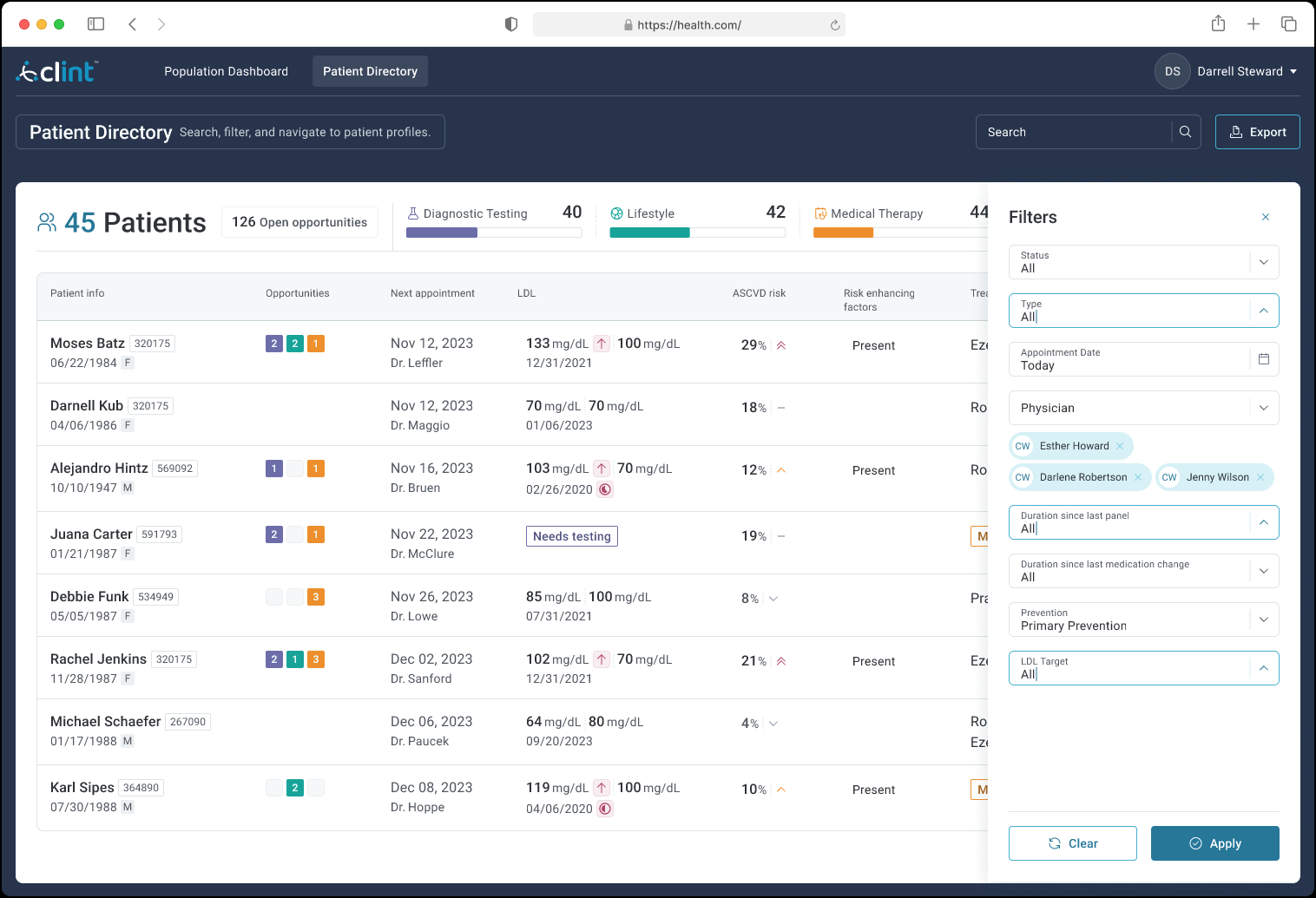
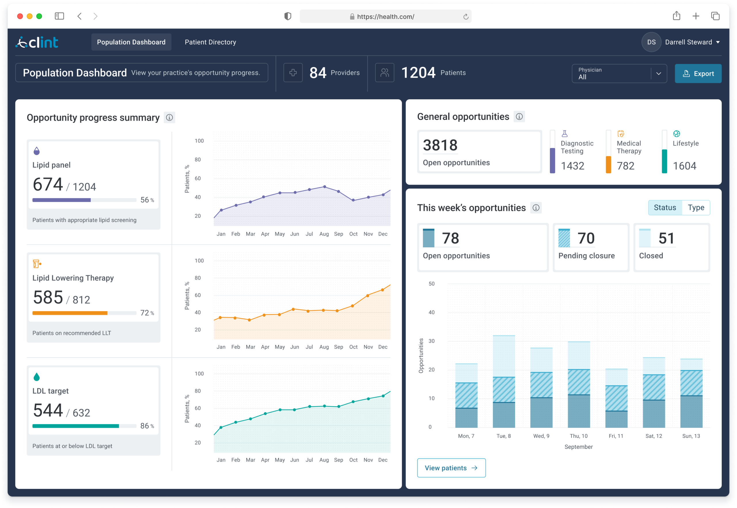
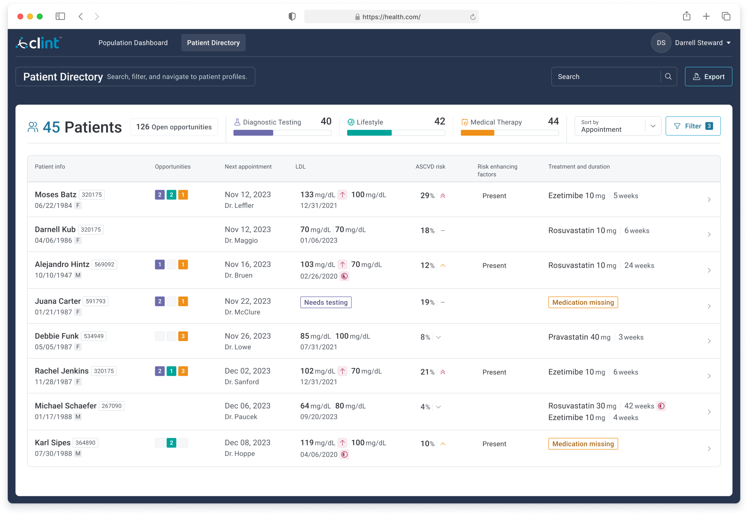
Gave physicians a view they had never had before: real-time progress across their entire patient panel on key cardiovascular benchmarks, including lipid panel completion, lipid-lowering therapy adherence, and LDL target achievement, with 12-month trend lines and a weekly opportunity summary.
Each row surfaced the data needed to triage: current and target LDL, ASCVD risk score, risk-enhancing flags, current treatment, and open care opportunities by category. Color-coded badges and “Medication missing” flags made the highest-priority cases immediately visible without requiring a chart drill-down.
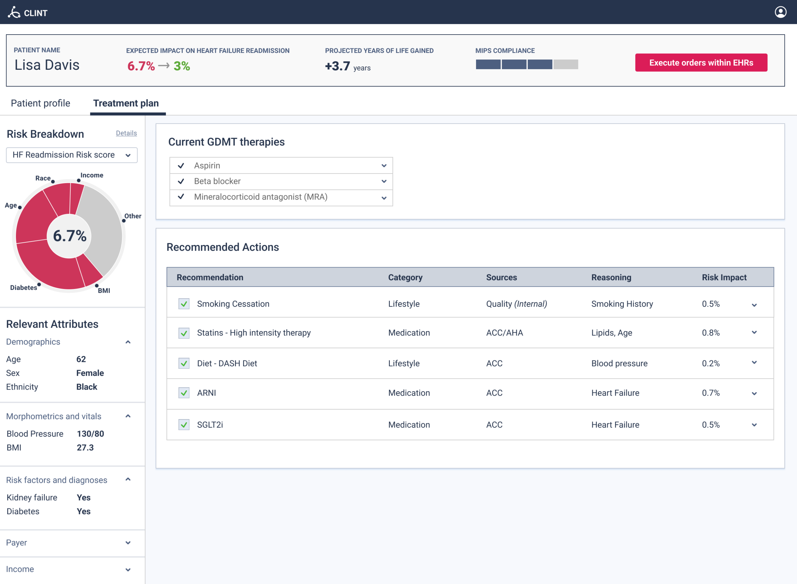
Each guideline card cited the specific ACC clause alongside the patient’s actual data that triggered it, not a generic recommendation but a precise one. An LDL trajectory chart showed treatment history, current vs. target values, and a projection, giving the physician longitudinal context rather than a point-in-time snapshot.
Users who reached the dashboard consistently reported strong value. The challenge was the activation path, a multi-step onboarding process with two significant friction points that limited the number of users who made it through.
A HIPAA-required legal agreement authorizing access to patient data. Many physicians didn’t have authority to sign it themselves, and administrators were often skeptical about sharing sensitive data with a third party even with full HIPAA compliance.
The data processing period took up to two weeks. Even users who completed onboarding often didn’t log back in once the dashboard was live. When asked, they cited time pressure and noted that a tool outside of the EHR didn’t fit naturally into their workflow.
The most direct solution, surfacing recommendations within the EHR at the moment of care, was not available. Following regulatory pressure, Practice Fusion had deliberately limited third-party treatment recommendations within their platform to avoid liability exposure.
Before the project ended I proposed an intermediate path: a lightweight EHR notification that didn’t make recommendations but indicated that care opportunities were available for a given patient and linked out to the dashboard. This would have used the EHR as the trigger without requiring Practice Fusion to host clinical guidance. The project concluded before this could be explored further with the partner.
The product was deployed through the ACC’s LDL-C Screening program and used across multiple practices. Users who engaged with the dashboard reported that it surfaced care opportunities they would not have identified otherwise and gave them a population-level picture of their panel that the EHR couldn’t provide.
This project taught me that the hardest UX problems in healthcare are often not about the interface, they are about the path to it. We designed a product that worked and that users genuinely valued. The gap was in activation: the wrong person was being asked to sign a sensitive legal agreement, and a two-week delay broke the momentum that an email invitation had created. I carried both of those lessons directly into how I think about onboarding and adoption in healthcare contexts.
This is a design portfolio case study. All content reflects my personal perspective and recollection of work I contributed to at Clint Health. It does not represent the official position of Clint Health, the American College of Cardiology, or Practice Fusion.