Recruit is a Saas desktop data-driven platform that streamlines clinical trial recruitment by matching complex protocol criteria with EHR data to surface high-quality candidates faster. As the sole designer, I led the product from discovery to launch, turning complex data science into a clear, efficient user experience.
Company Clint Health
Role Product Designer
Discovery
The first step was to align teams (business and product) internally on the product's main user (clinical trial recruitment teams), followed by defining important internal stakeholders (data science and customer success teams).
User Interview
Next we interviewed a few people that had experience in a few different positions within the recruitment space.
The main takeaways from the interviews were: map of different possible workflows within sites, the specific workflow to determine eligibility were very manual and would vary significantly from site to site, time spent on each patient feels often unnecessarily high mainly due to how hard it was to find the necessary information in the EHR.
Internal Stakeholders
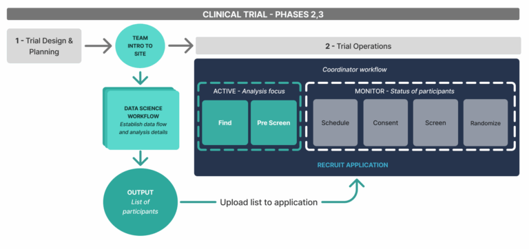
To understand the full landscape in which the product will be used (clinical trial phases, common types of recruitment sites, hierarchy and workflow of recruitment teams), I was able to leverage the knowledge from a coworker that had previous work experience in clinical trial recruitment.
Next I interviewed the data science and customer success teams to understand and map their overall workflow, technical capabilities of the dataset and analysis along with their needs from the product.
Exploration
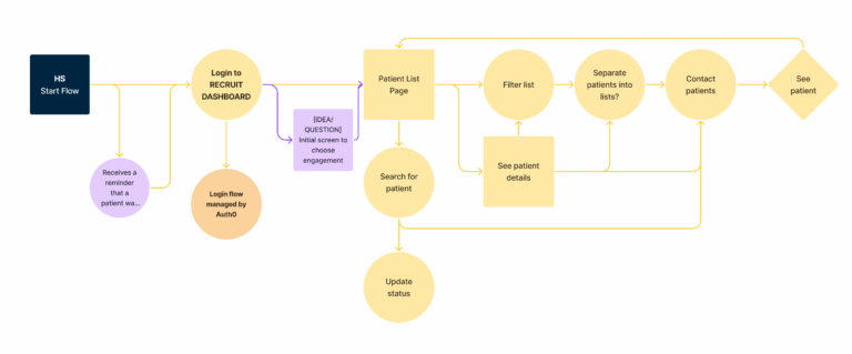
I started by mapping key user flows and identifying the most common tasks for both internal and external users. This informed feature prioritization, balancing user needs, technical feasibility, and timeline.
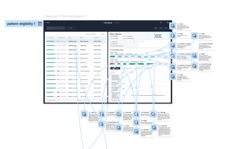
Prototype & feedback
The prototype was tested internally and externally through a mix of usability tasks and open feedback. Most users easily understood the interface and completed key tasks without issues. Feedback led to small refinements in labeling and data presentation to further improve clarity and usefulness.
MVP – Minimum viable product
There was a need for an MVP for more thorough testing and validation, not only of the full interface but also of the data analysis performance. This process was closely monitored through usage analytics (MixPanel) and ongoing communication with the users. The most relevant feedback involved core features such as eligibility determination and participant status.
The full product team collaborated at this step for the best solution considering not only the insights from the MVP, but also the internal technical capability of each area.
Version 1.0
On Version 1.0 I redesigned and significantly improve how core tasks were performed on the interface, included supporting elements that were deprioritized from the previous versions (landing screen for all trials, FAQ and Settings).
Workflow improvement
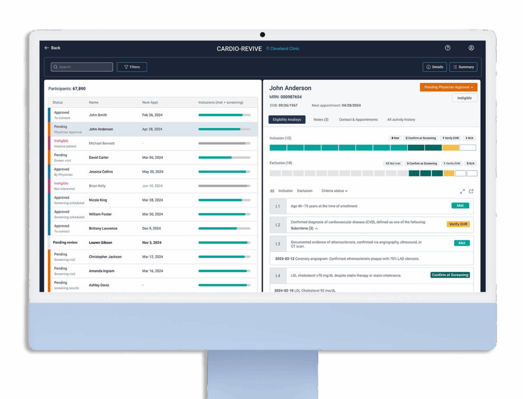
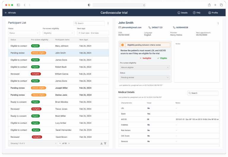
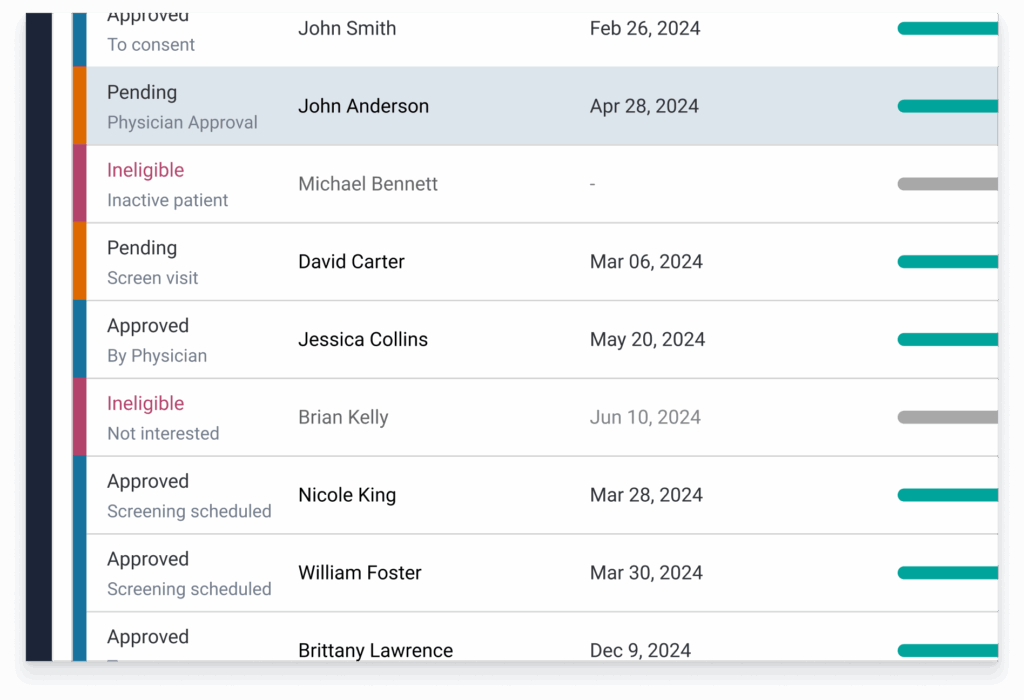
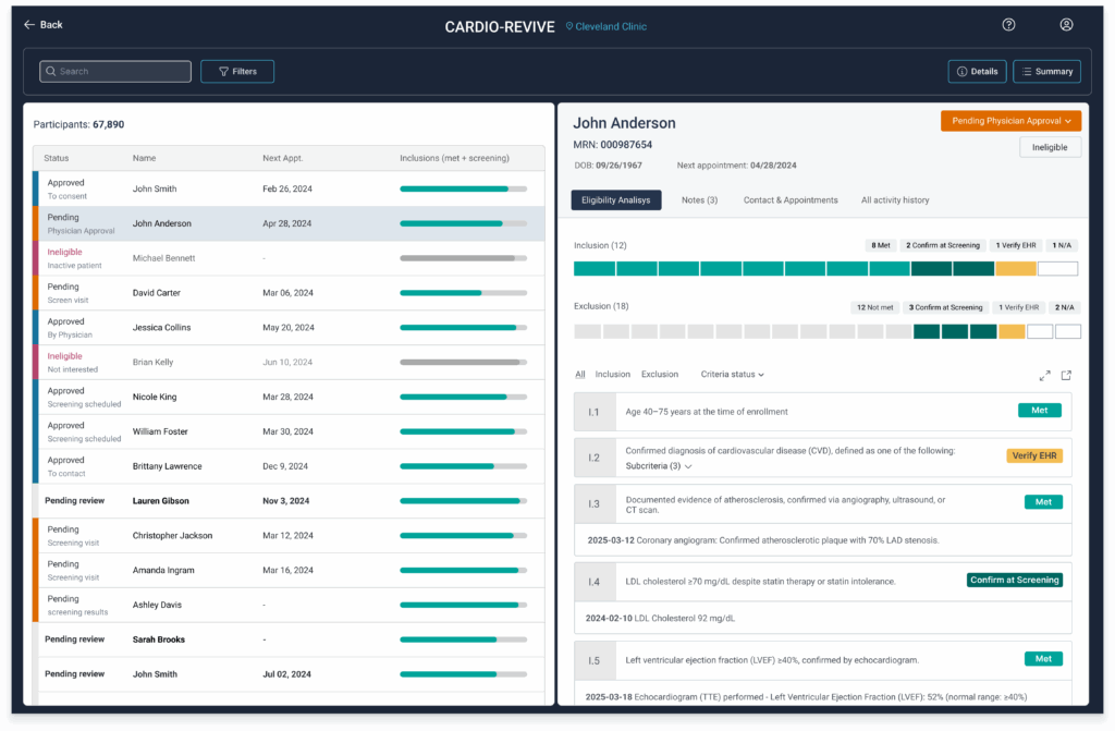
The participant table (left) also got significant improvements, the status column became more clear, informative and actionable to streamline the user’s workflow, by bringing the status and reason to the table.
Filters got a significant improvement with more types of filters available to users in a separate section allowing also more clarity and ease to use.
Easy access to evidence
The patient details section (right), had the overall layout improved by using tabs, this allowed me to accommodate a large amount of important information about the patient in a way that was easy to access and organized.
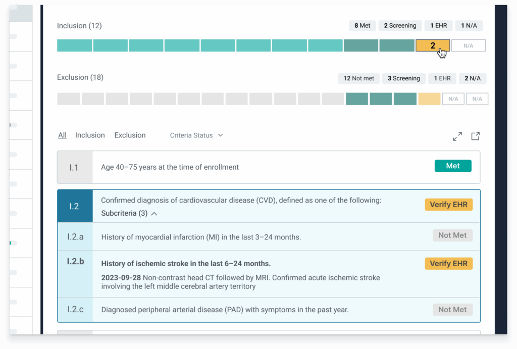
Leveraging the increased space on the interface, the eligibility analysis section got more integrated between ranking (bars) and medical details (table), now when clicking on the bar for each criterion, it highlights the evidence found on the EHR data to support how it was categorized by our technology and including any specific values that can be useful for coordinators.
Thoughts and experience
This project was pretty fascinating, I was able to build a product from scratch as the sole designer, while also working deeply integrated with the data science and engineering teams.
It was also challenging, design decisions had to be made in parallel to the data analysis developing and evolving, while the engineers built the structure to support it all.
The result was an incredible product that received a lot of compliments from users about how much their workflow got streamlined and results improved significantly.